Get Started with Indition
Try any of our sales and marketing software for 30 days. No credit card required.
Get Started TodayLearn more about our products
Get to know more about Indition and what it can do for you whether you need sales, marketing, ecommerce, or forms.
View ProductsFeatured Indition Products
A Better Way To Do Business
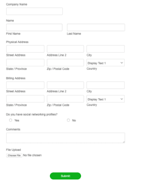
Indition Forms, Contests & Surveys
Indition Forms allows anyone to create custom online forms for their website to capture customer and user data. With an intuitive, drag-and-drop interface creating your forms is easy to do and you never have to worry about writing code.
Learn More

Indition Mobile Forms App
Take your forms on the go with Indition Mobile Forms. Design your forms online and download our mobile app for iPhone and iPad. Get all the power of Indition forms on your mobile device with the added benefit of offline submissions.
Learn More
Indition CRA™ Marketing Automation
Indition Marketing Automation enables you to create a one-to-one relationship with your customers and future customers. Using advanced AI, CRA™, Customer Relationship Automation takes the impossible and makes it easy.
Learn More